This project was created in collaboration with Humber College and full case study posted with permission from the Bachelor of Design Program Co-Ordinator as well as the client.
UX BRIEF
GOAL:
To re-create the visual and user experience for the clients and visitors of Nightwood Theatre. By utilizing a collaborative branding approach that accurately represents the emotions and goals expressed by Nightwood Theatre, users can have a visual and interactive picture of what the theatre has to offer. From plays, to a detailed about page, as well as a simple but powerful interface we can create an experience that is human centred and aligned with the creative vision of the company.
ROLE:
All works and deliverables created individually not including User Persona Ideation which was collaborative.
OBJECTIVES:
- Meet with the client and understand their needs
- Adjust and refine current Information Architecture Structure
- Create a colour palette that accurately represents the imagery and goals of the brand
- Create a responsive interface that minimizes error and provides a pleasurable experience for a multitude of user groups
- Portray the brand’s vision through imagery, colour and structure
- Create a working prototype that assesses two tasks
- Fulfill the aforementioned goals with considerations for age, ability and accessibility
USER NEEDS:
- Understand and discover Nightwood Theatre
- See available plays in the current season
- Navigate through a dense array of information in a way that is simple and concise
- Facilitate the purchase of individual tickets and season’s pass
- Immerse themselves in the rich community based history the company has to offer
- Recruit and encourage up and coming playwrights, actors and other artists
- Educated about theatre in a confident and inclusive manner
BUSINESS NEEDS:
- Portray their branding simply and effectively
- Increase ticket sales
- Increase season’s pass sales
- Document their rich history in a human centred manner
- Encourage education groups and artists to join
- Promote sponsorships and funding support for the theatre
- Actively engage with the community to create an inclusive theatre environment
- Create a powerful marketing piece and central hub for all that their brand has to offer
Process and Research
Initial Product: Pre-existing

Primary Goals:
- UI and branding refresh
- Accessible UX for wide demographic
- More content focused and interactive
- Clean interface that promotes a more relevant colour scheme
- Responsive with mobile, tablet and web
User Personas:
Anna Attorney
Anna is a 32 year old criminal prosecuting attorney who works 45-60 hours a week. She lives in the downtown core with her boyfriend of 4 years. Anna puts aside time monthly to advocate for children in the foster care system. Anna aims to keep up with current social issues and also has an appreciation for the arts.
Characteristics:
- Hardworking
- Intellectual
- Compassionate
Motivations:
- Knowledge
- Convenience
- Contributing to her community
Frustrations:
- Not enough time for personal interests
- Wants to feel more connected to her community
___
Peter Performer
Peter is a 20 year old single student currently studying at Humber in their Theatre Arts-Performance program. He lives in Mississauga with his parents. He is actively auditioning for theatre and TV roles in order to improve his craft and to become a familiar face on Canadian acting scene.
Characteristics:
- Passionate
- Eager
- Energetic
Motivations:
- Gaining experience
- Having fun
- Exploring options
Frustrations:
- Balancing school, friends and trying to start a career
- Trying to become confident and feel a part of a community
Information Architecture Process
Card Sort Format: Open
In order to accurately organize the Information Architecture, it was imperative that I completed a Card Sort. I opted for an Open Card Sort as this allowed the users to have more freedom over organizing such a vast amount of content.


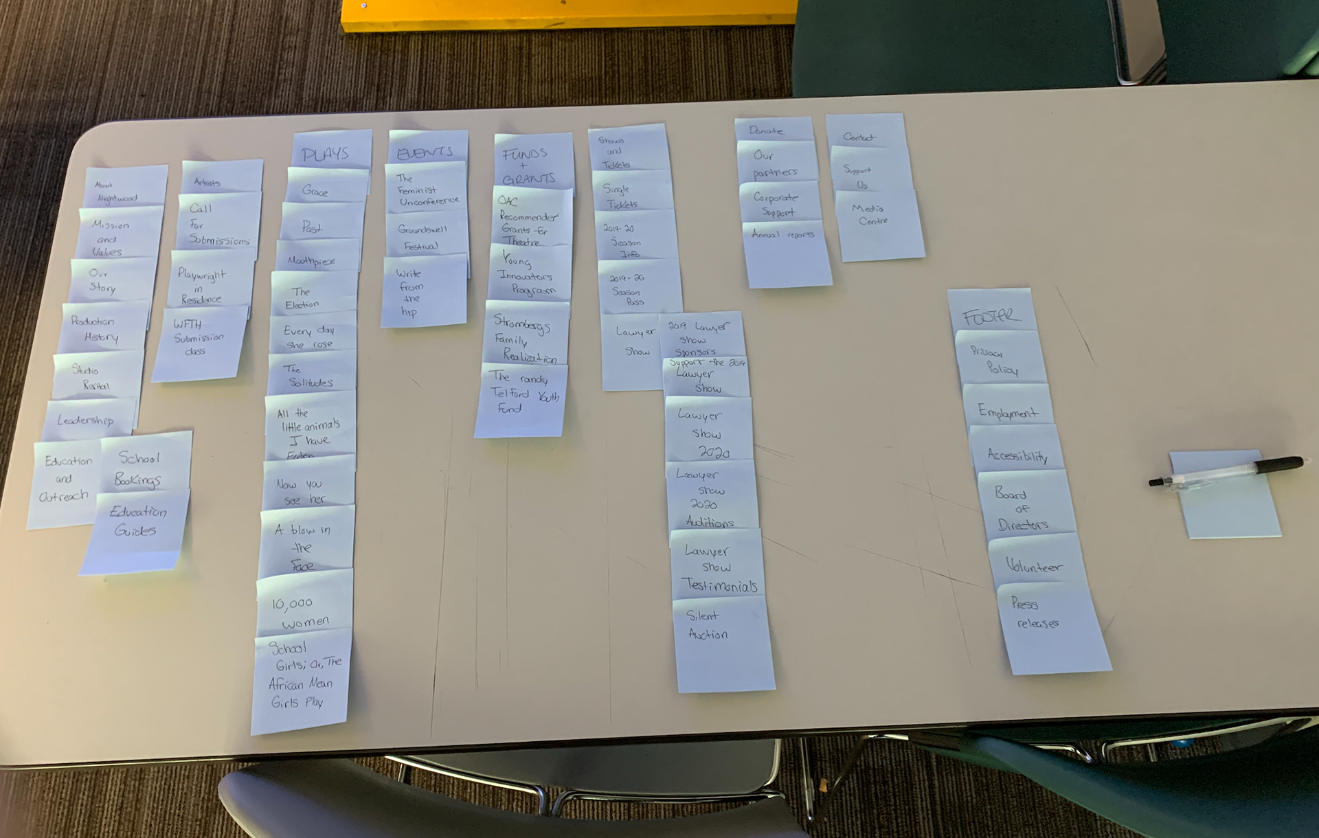

INFORMATION ARCHITECTURE MENU LAYOUT
Due to the vast amount of information and very high density of pages on the website, I created a navigation IA layout in order to properly plan out the finalized menus after the card sorting.

USER FLOW DIAGRAM: PURCHASING A SEASON'S PASS
Since the IA was redone completely, it was important to understand the path of the user to better understand the appropriate hierarchy. Below you can see the task flow for purchasing a ticket or a season's pass. This point of the process created a clear understanding of how the user was to interact and flow through the structure of the website. This portion of the research and UX allowed me to understand the current pain points and prevent future pain points for users.

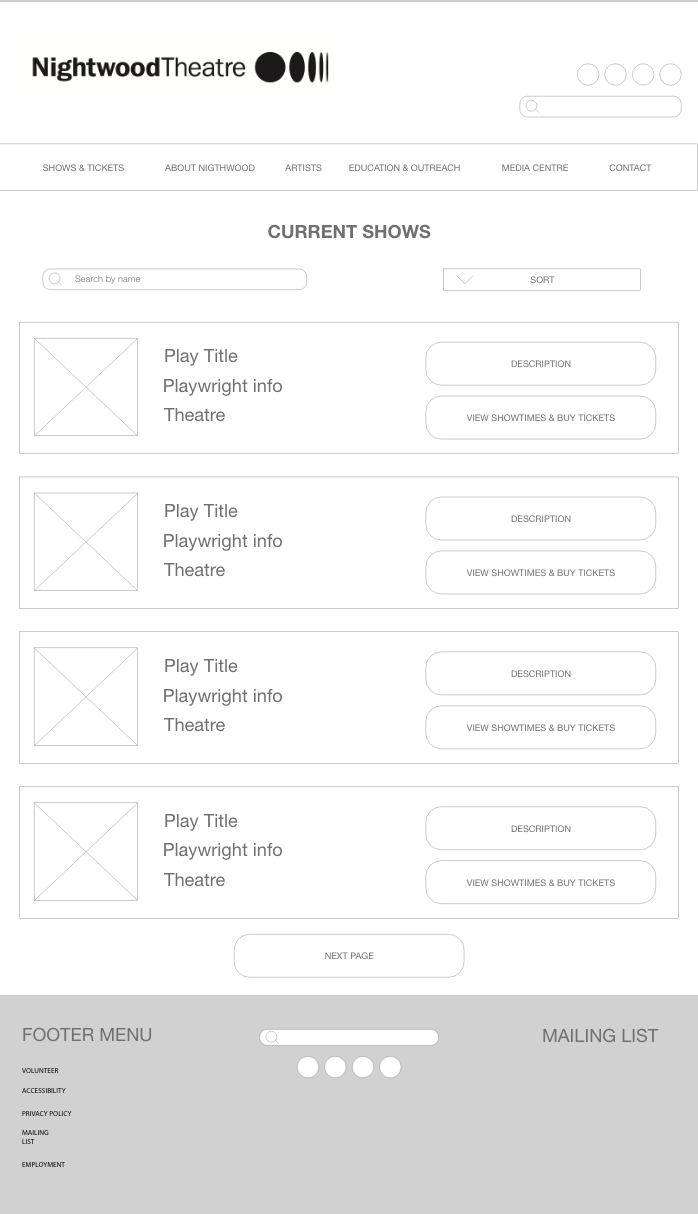
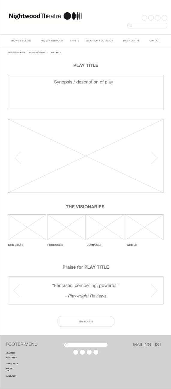
Wireframe: Pre-Creative
The pre-creative low fidelity wireframe gave the perfect opportunity to begin placing and replacing areas of the website. Since the theatre really only has about 4-5 shows per year, I opted for a larger format "ticket stub" style layout that gave a thoughtful but minimalistic feel.
MoodBoard & Creative Strategy
The creative strategy was undoubtedly the most challenging part of this entire project because of the potential amount of plausible options the website could offer to display the appropriate aesthetic.
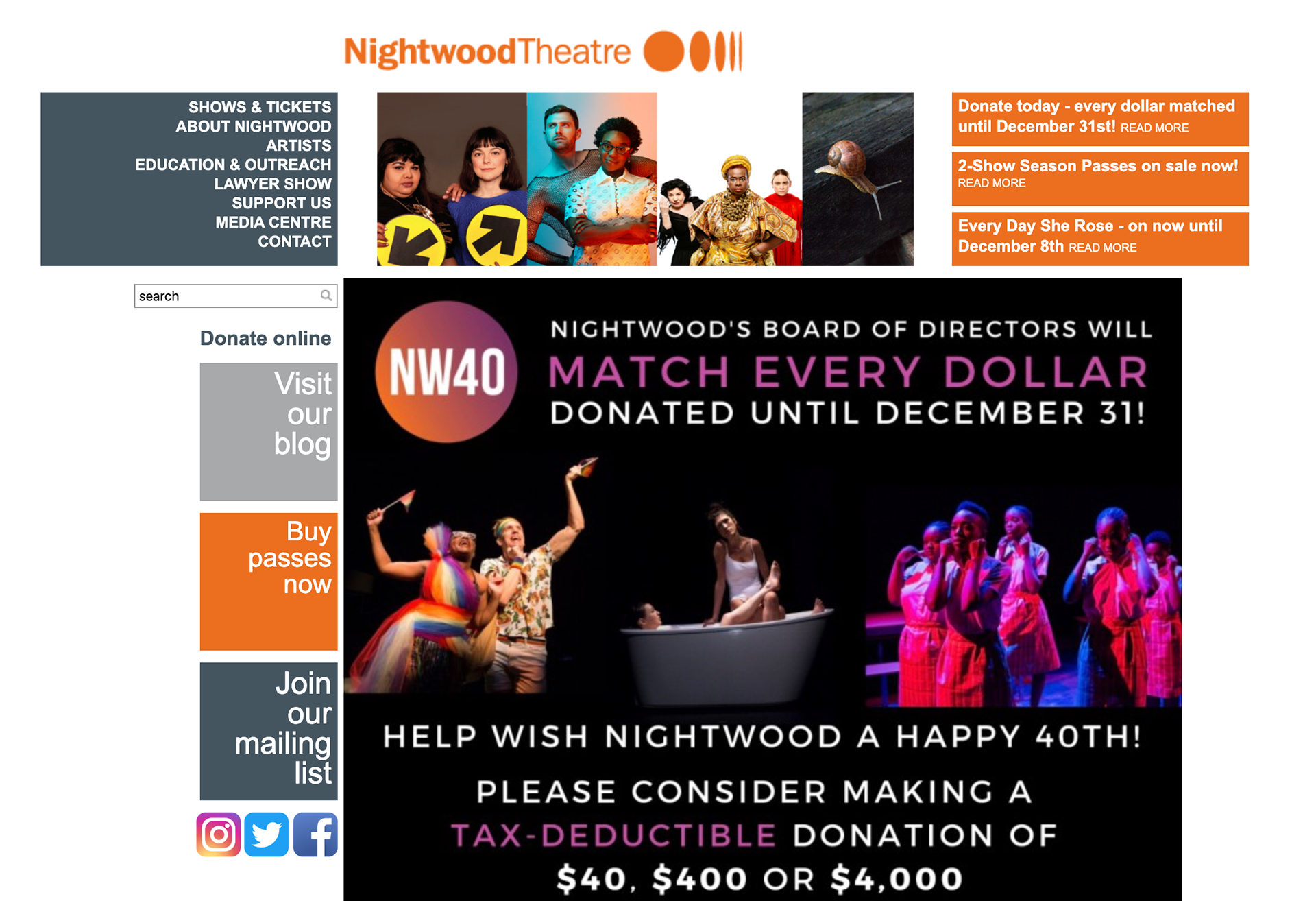
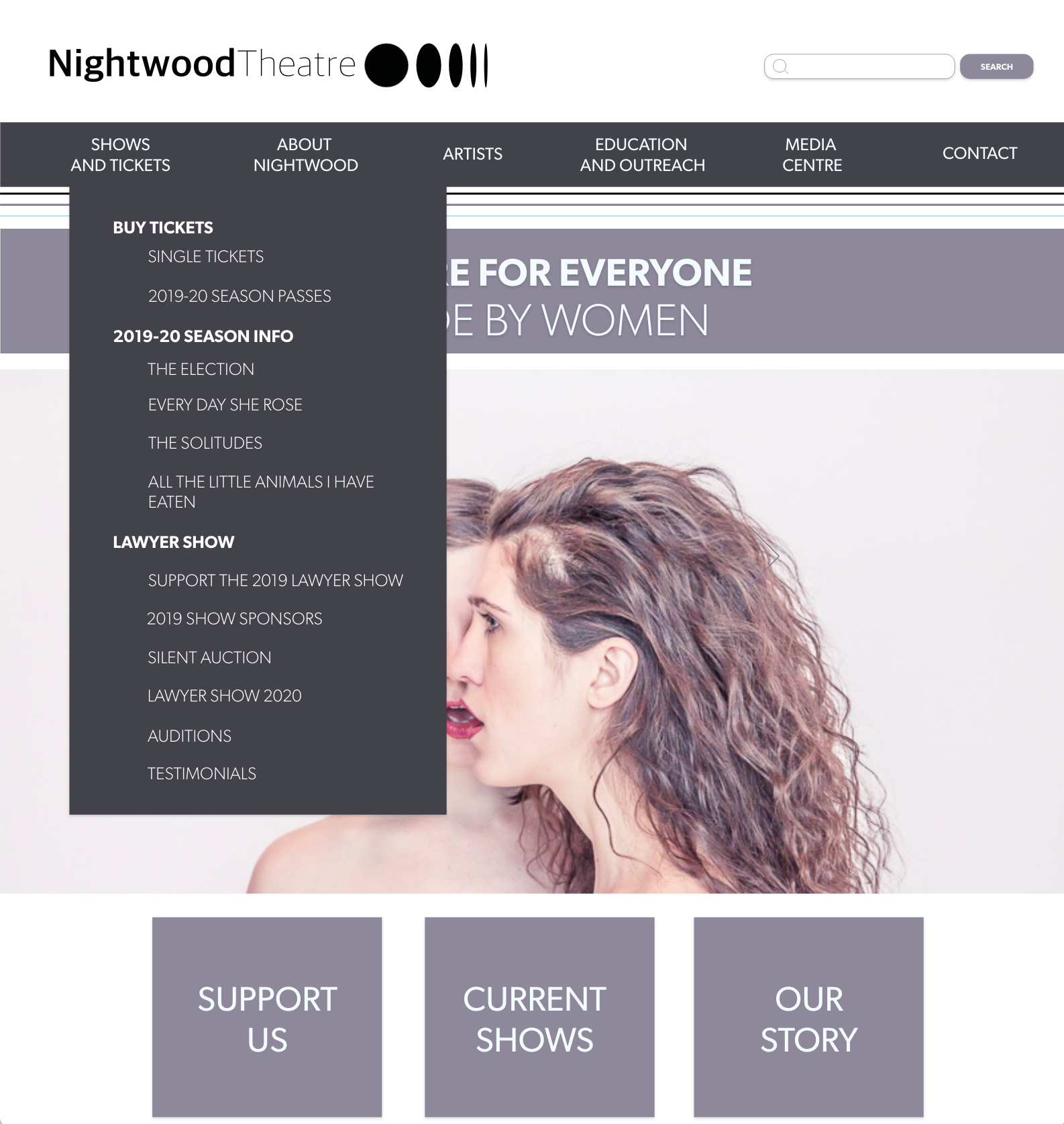
I decided in the end to play up the fresh and modern approach using a gender neutral colour palette of soft blues, a mauve-grey, and a black to ground the text. Since inclusion was a huge point in their branding, I wanted a clean comfortable palette with high contrast between the text and the background. This made the website AODA compliant as well as congruent with their branding.

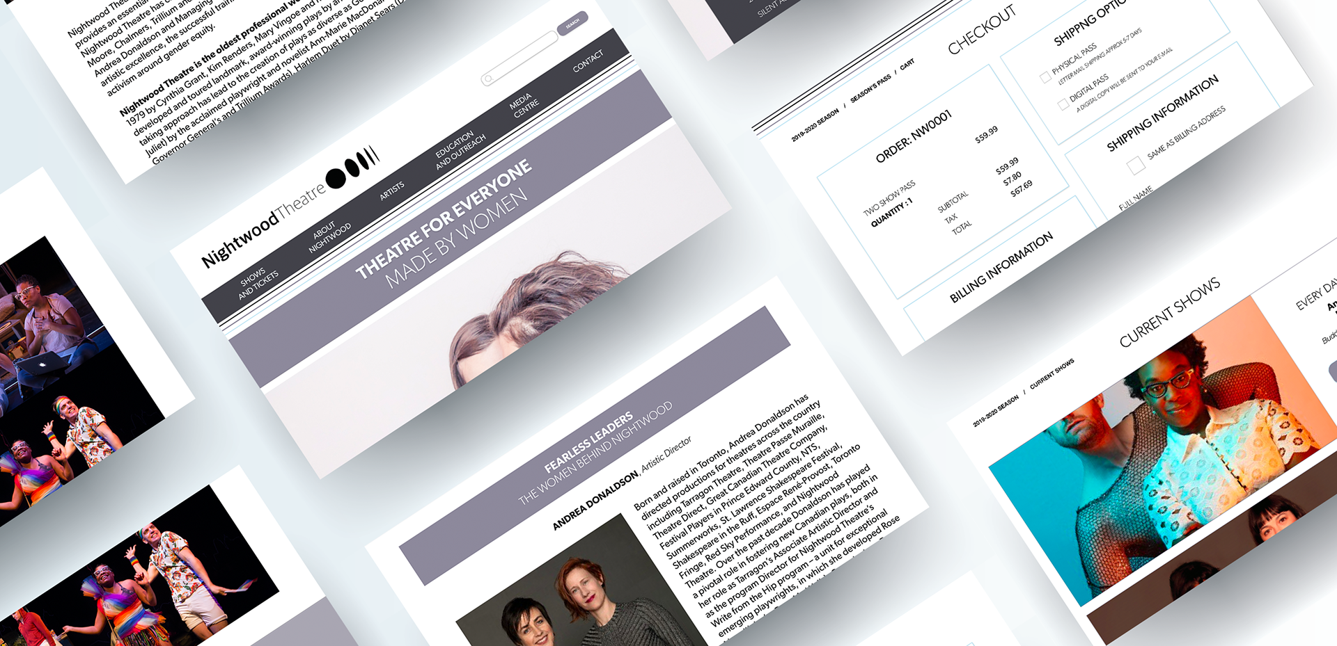
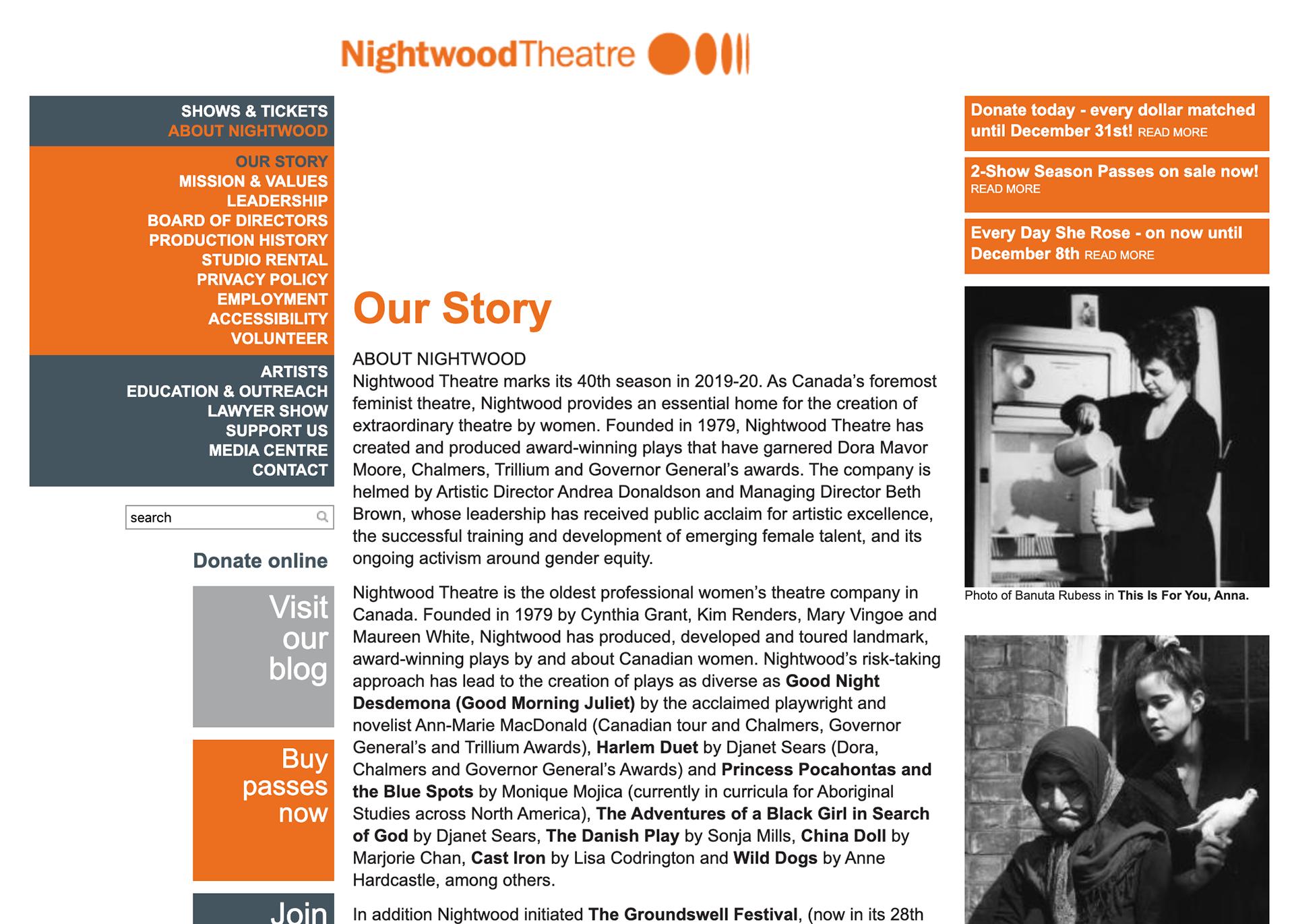
FINAL REDESIGN


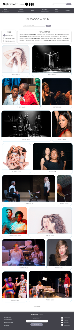
The Nightwood Museum
The design of the Nightwood Museum was by far the most important part of the design process in my opinion. This was the one piece that the company was missing from their previous design, and was clearly the most essential. As designers we always have to think about the 'why', and in this project I found myself constantly asking: "Why Nightwood? How can we show new users what this beautiful organization is all about? How can we show them how rich and vibrant their community is?".
I came up with a bento box, Pinterest-inspired layout that felt modern and lively. By allowing users to sort through popular tags (and arrange the memories how they choose) they can create an immersive gallery experience that brings these beautiful plays to life. For returning users, it can allow them to re-live the shows they participated in or viewed as a spectator.
This page was the 'why' factor for the entire website.

Conclusion
This project was an incredible experience. Working with a non-profit company that was highly community focused really presented a beautiful purpose to the project that made the experience incredibly unique.