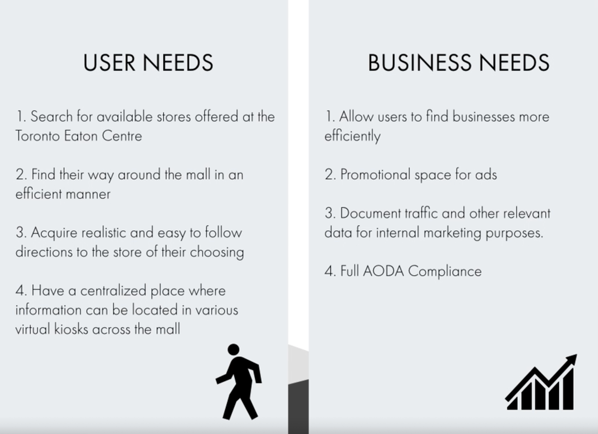
Purpose
The purpose of this project was to create an interactive large touch screen experience for the customers at the Toronto Eaton Centre. By using Design Thinking, and principles of Human Centred Design we can create an experience that is simple, relevant and modern to make the shopping experience more enjoyable to new and frequent visitors of the mall.
Challenges
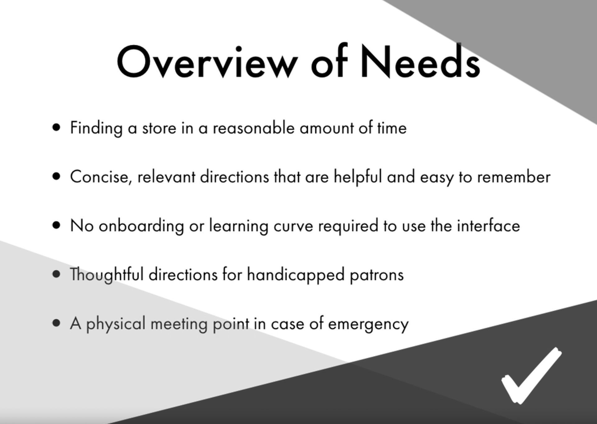
Meeting the needs of a wide variety of user was the main challenge throughout this project. Since the Eaton Centre is home to shoppers that range from children to the elderly, and even include international tourists, creating a universal interface that extended beyond cultural barriers was a priority.
Creating an interface that used the correct metaphors to work for a wide variety of visitors from the area and even from other countries was an important piece of the design puzzle.
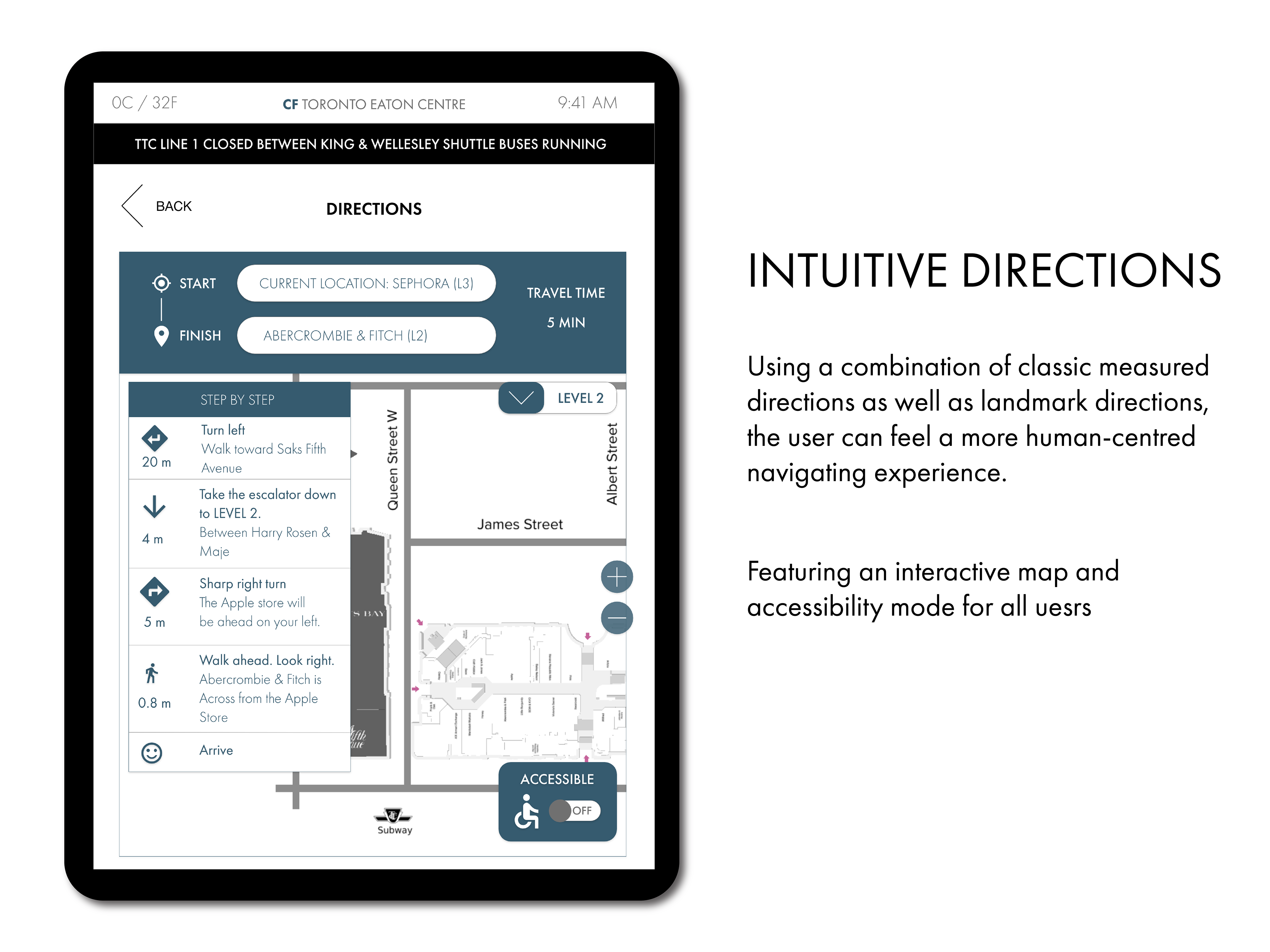
Another main challenge was creating an accessible interface that would provide accessibility option for directions was another priority that constituted the majority of the purpose of the application
THE PROBLEM SPACE
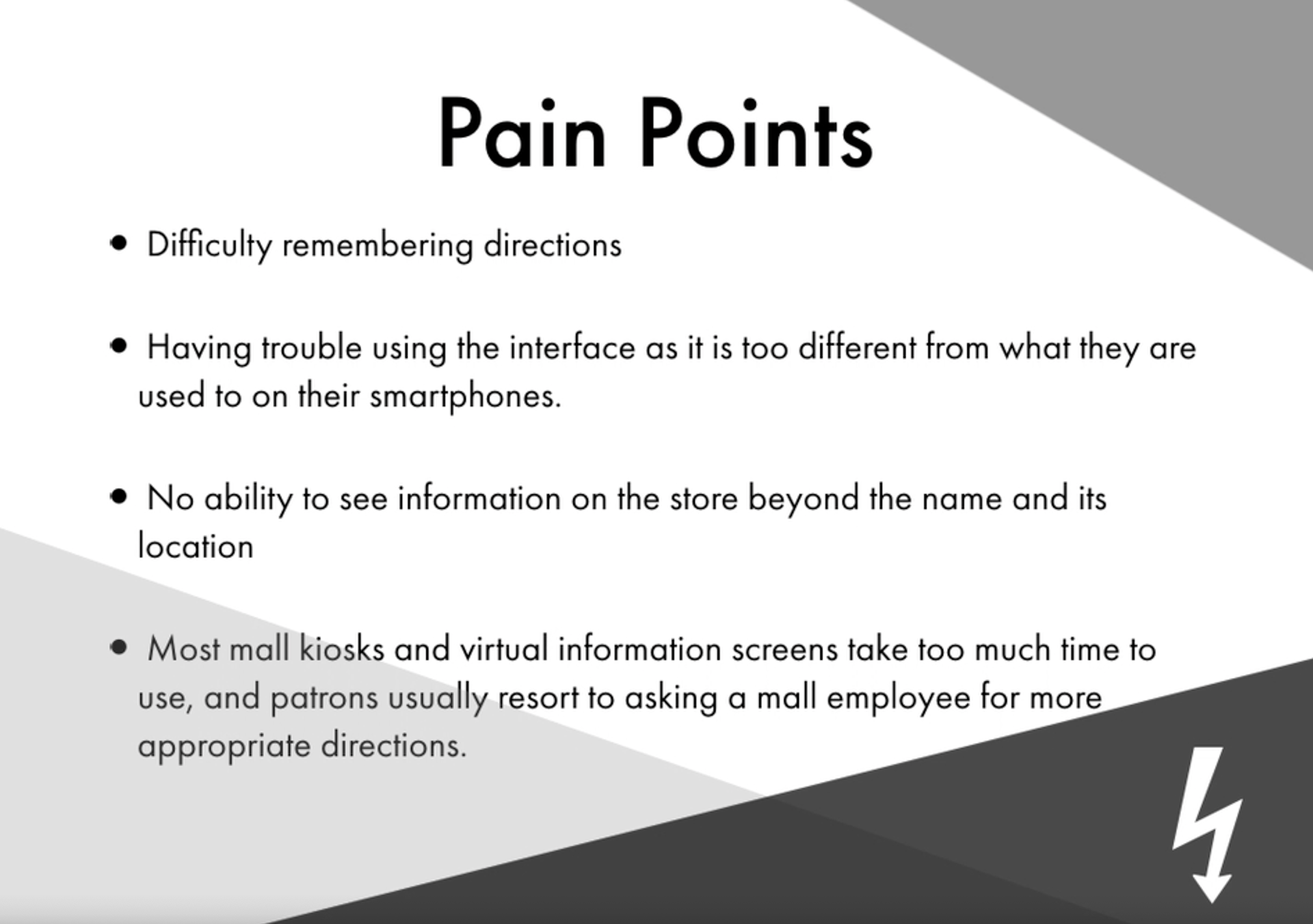
Creating an effective solution for finding stores in a large mall
Creating a timeless interface that is relevant and provides utility to a wide variety of users
How to integrate directions that support both ambulatory patrons and those who require more accessible directions
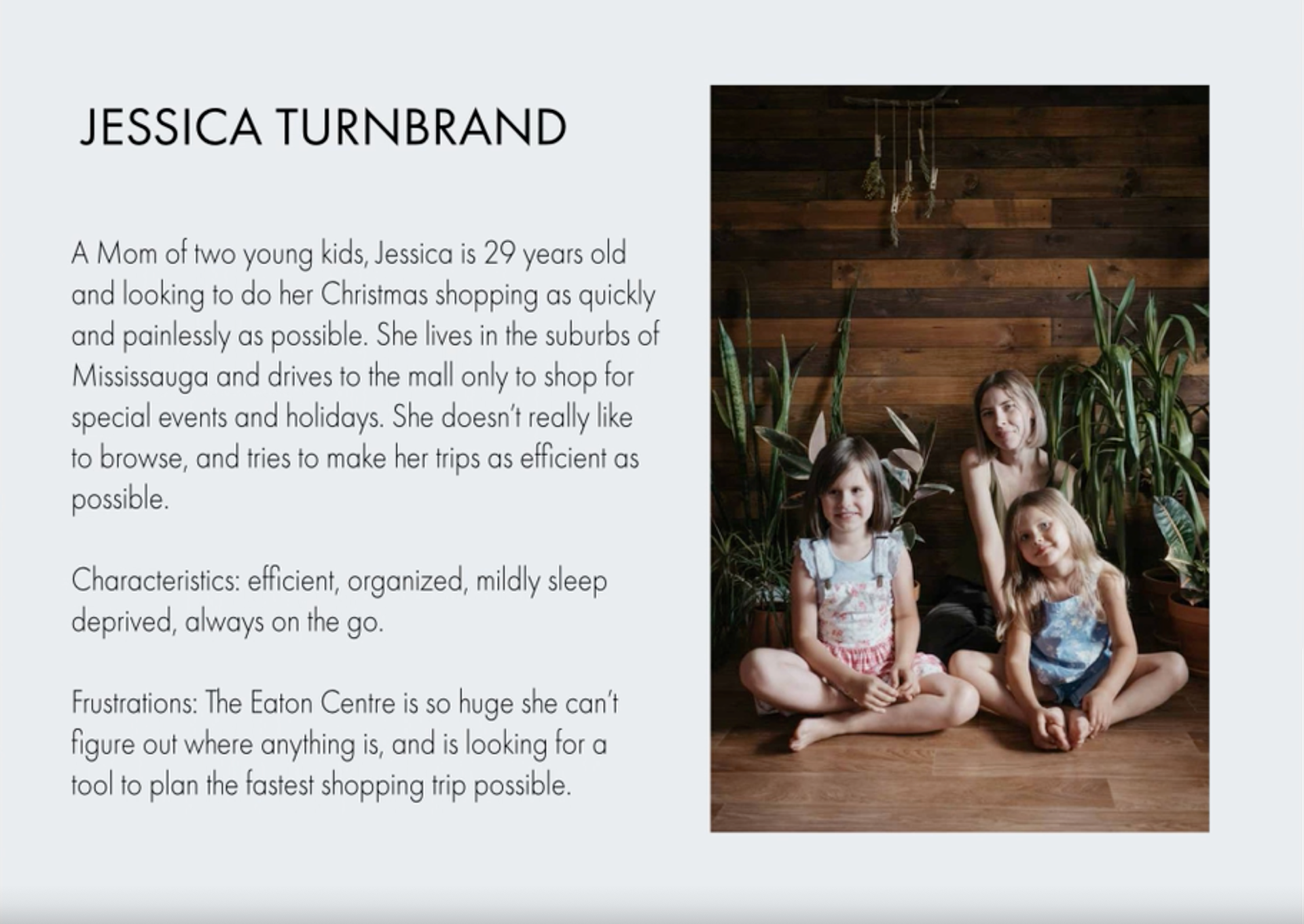
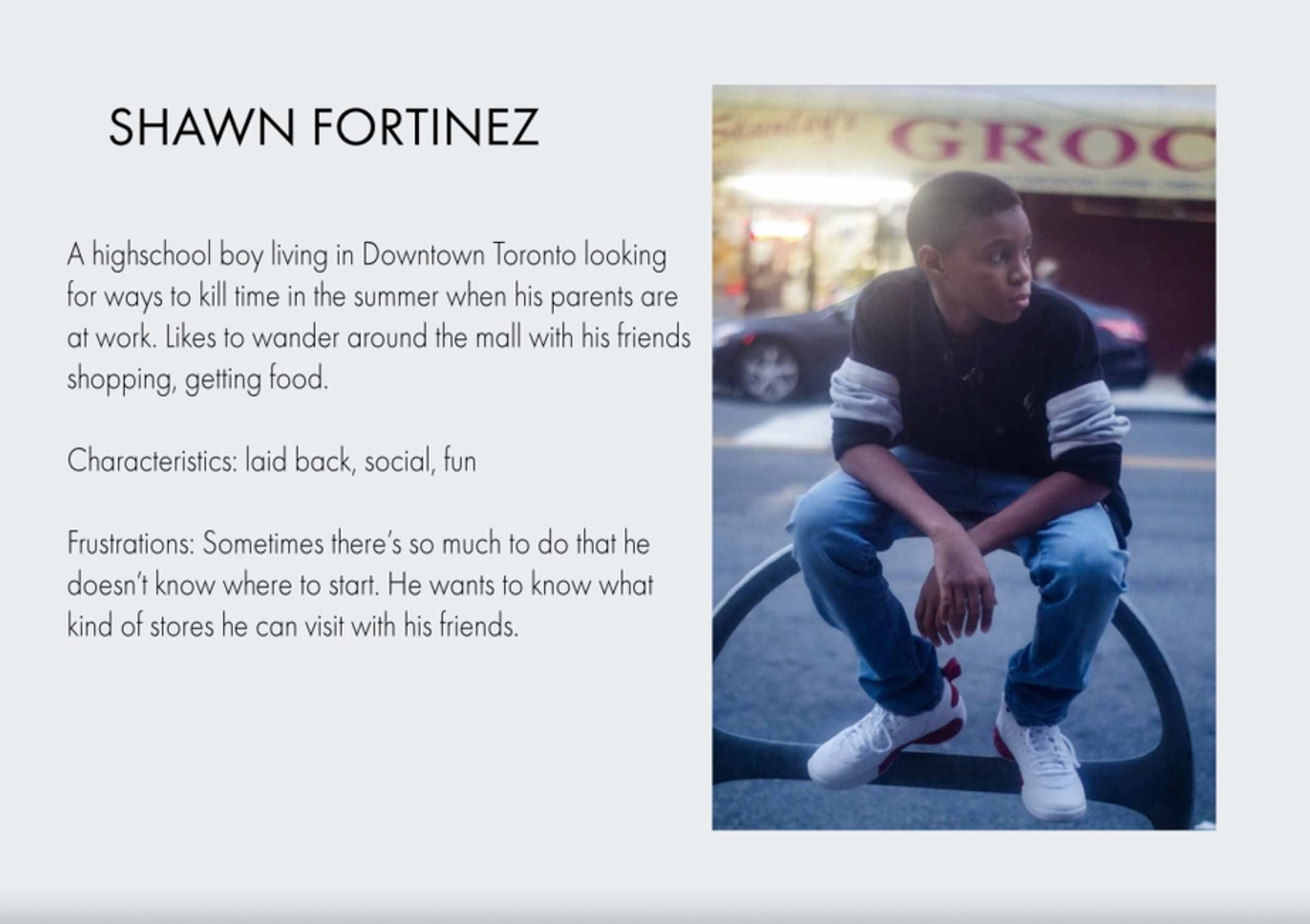
USER PERSONAS
THE DESIGN PROCESS

Wireframes

User Flow Diagram
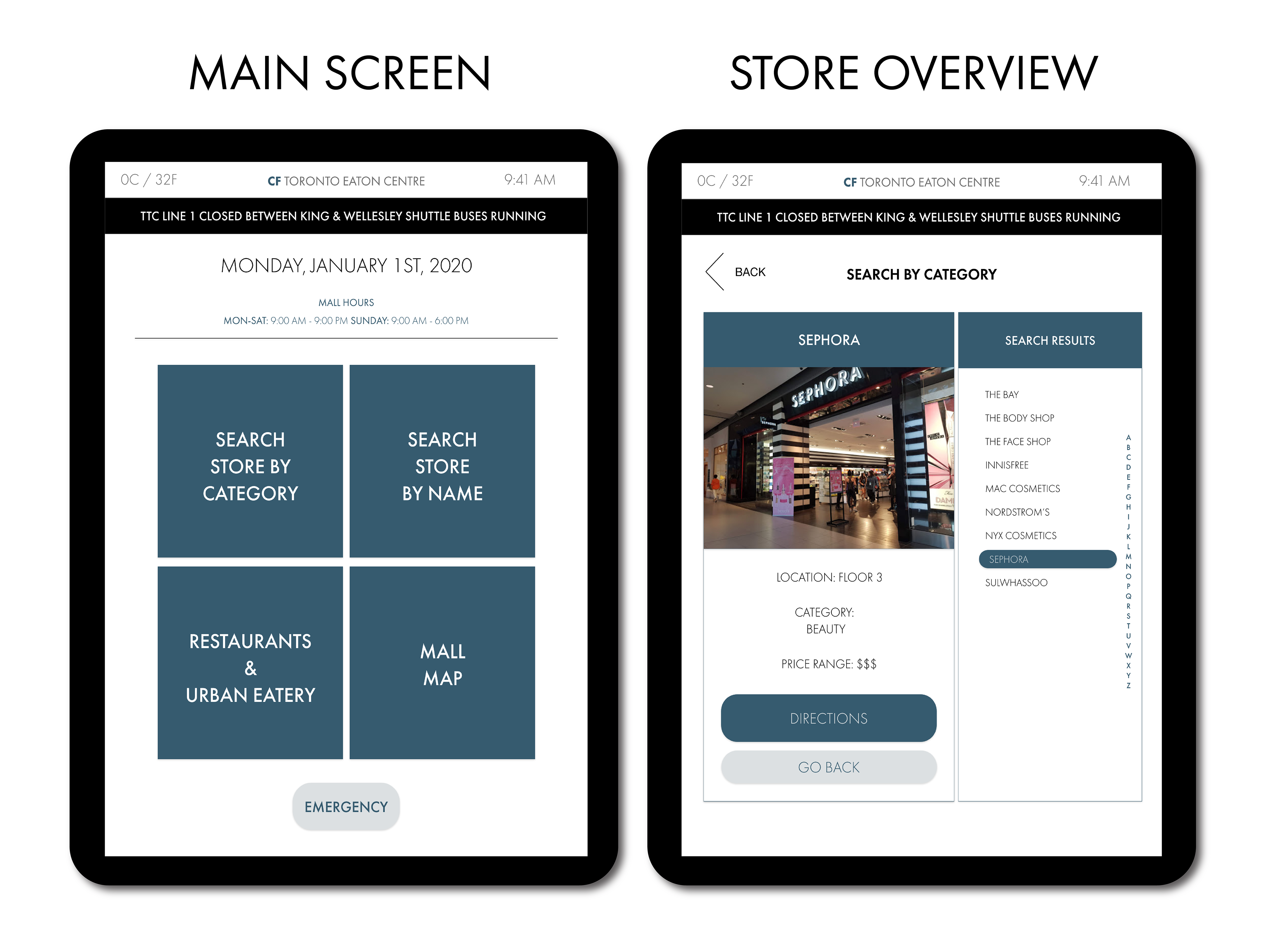
Task: Searching for a store by name

Initial Wireframe Prototype Testing
Research Type: Moderated Usability Testing
TASK ONE:
Searching for Abercrombie & Fitch by name, and seeking directions
User Type: New visitor to the mall, tourist, or infrequent visitor
User searches for the store by typing in the first letter of desired store, selects and proceeds with directions
User searches for the store by typing in the first letter of desired store, selects and proceeds with directions
TASK TWO:
Searching for Sephora by Category
User Type: New visitor to the mall, or searching for a new store
User searches for the store by category.
Main User Feedback
Problem 1. The initial prototype had the keyboard reversed, which confused the user and impeded on the task flow
Solution: Place the keyboard for input on the left hand side, and the action on the right
Problem 2. Insufficient error prevention which caused the user to have to start from scratch if an error was made
Solution: Include a "Go Back" button at the bottom as well as the top of the interface
Problem 3. The starting screen was received well, however users were not sure how to initiate and tapping the screen was not clear enough
Solution: Add copy that instructed the user to "tap screen to begin"
Problem 4. The accessibility directions were at the top of the screen, which was shown to be too high up for users in a wheelchair
Solution: Move button to the lower third of the screen for easier access
Problem 5. Emergency help button on the sleep screen was too high up. Some users suggested it be lowered in case a lost child needed to reach it
Solution: Move the button to the lower portion of the screen. Adults had no problem extending the reach downwards and this change makes the interface more child friendly.
CREATIVE STRATEGY
FINAL PROTOTYPE
Select Screens

Quotes and Commentary
Professor: Sarah English
"Overall: Really great work! It looks good and works well,"
"This [directions] screen is great. The left handed instructional panel is excellent."
Wrap Up and Overall Impact
This project was challenging in a positive way. Although we didn't have a real client, our mock client is a very real company that would approach this project in a professional setting. By staying focused on empathizing with the users, this project taught me how to design for a behavioural demographic that are task oriented, versus a more traditionally specified user. It was particularly valuable to learn and understand accessibility regulation and stretch the empathy even further beyond an ableist perspective we often find ourselves trapped into- specifically if we the designers are able bodied. This was the most important lesson and challenge the project offered, and by learning this, I can continue to push into a deeper level of empathy and understanding to create better interfaces for a wider variety of users.